Friends & Family

Project Vision
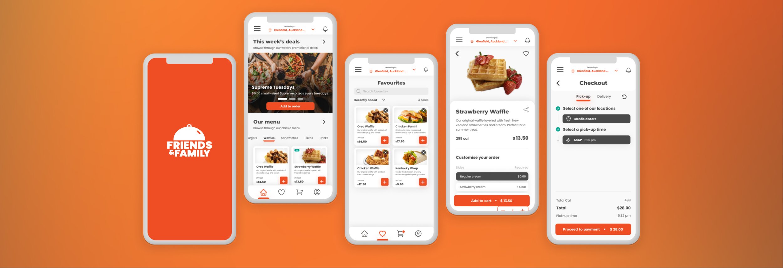
Friends & Family is a medium-sized family restaurant with 5 different locations across New Zealand. They now require a mobile application to meet the needs of their rapidly expanding customer base.
For the purposes of this project, we have focused on the food ordering experience of the application - captured in our persona creation and goals. The MVP for this product was developed as a mobile application optimised for iOS 16.
OVERVIEW
DURATION: Jan - Feb 2023
PROJECT: Friends & Family Mobile Application Case Study
ROLE: UX / Research / Visuals
THE GOAL
To provide an intuitive and inclusive mobile food ordering experience.
CHALLENGES
Accessibility and inclusivity - must address visibility impairment and language barriers
Navigation and flow - must be easy to use and navigate
Visual design - the menu should be easy to read, and the items should be organised in a logical manner.
Kick off
USER INTERVIEWSTo begin understanding our audience, I interviewed a range of different people who fit into our target group; I wanted to find what their unique needs or challenges might be, determine user groups and how the product might help to solve some of their problems
HYPOTHESIS
I believed that users would typically find it frustrating when they aren’t able to read the menu items for whatever reason to find what they’re looking for. I interviewed 4 people to determine common pain-points while ordering food.
To understand the processes and emotions that people experience when ordering food from a mobile app
To understand what people find most frustrating about the food ordering process in a physical restaurant.
To understand what people depend on most when ordering food at a physical restaurant
To understand what the product is and who it is for
To identify common user behaviours when people order food
RESEARCH GOALS
Legibility
PAIN POINTS
Efficiency
Service
Lack of time
User groups
USER INTERVIEW RESULTSFrom my research, I determined 2 representative groups of users with similar interests, goals or concerns
This customer is a non-native english speaker who enjoys dining in. Typically comes from a large family
This customer leads a busy and demanding lifestyle with an unpredictable schedule. Often has a degree of visual impairment
Meet our users
USER PERSONASTONY
Age: 23
Education: studying finance
Hometown: Singapore
Family: lives with father and younger sibling
Occupation: full-time student
GOALS
To meet new people and make connections
To improve English speaking and comprehension by immersing himself in the culture and food without ‘breaking the bank’.
To take care of his younger brother and make sure he is eating well
FRUSTRATIONS
“Lack of translation options often makes ordering food take too long. Instead of learning what words mean what, I just feel anxious”
“My family depends on me for translation - but it is difficult to translate everything manually”
NATASHA
Age: 46
Education: MBChB (Medicine)
Hometown: Melbourne, Sydney
Family: Married + Daughter
Occupation: Doctor
GOALS
To provide fast, homely, healthy meals for her family.
To always be there for her patients on call, even if that means taking on last minute appointments.
To actively maintain a healthy work-life balance
FRUSTRATIONS
“Physical menus are often hard to read, which can take a long time to decipher characters for ordering”
“Restaurant staff sometimes get impatient”
“It is difficult to find delivery options that are healthy, reliable and efficient”
User journey map - Ordering from a restaurant
Problem Statement: Tony is a full time student from overseas who needs an easy way to translate menu options because he wants to order new items without feeling pressured or anxious about reading menu items
Problem Statement: Natasha is a busy medical professional who needs to be able to read and submit orders quickly because they have no time to cook and provide for their family.
Competitive audit
Goal: compare the ordering experience of each competitor’s app
Early Concepts
PAPER WIREFRAMESIt was clear from our studies that users often feel confused or frustrated when ordering food. I created a bunch of paper wireframes to decide which could better address these concerns
HOME PAGE
We wanted users to see current deals and other offers that may interest them as well as the menu as soon as they log in.
CART AND PAYMENT
Here, I made sure that users had all the information they needed to make an informed decision - making it as simple as possible. It was important to keep the flow consistent with other screens in the app.
VIEWING FOOD ITEMS
Following our earlier user interviews, I wanted to prioritise the size and quality of the images and have all other buttons and information revolve around it.
MENU SELECTION
I played around with two menu selection screen styles. One involved vertical scrolling, organised by selector tags. The other involved horizontal scrolling organised by groups
Wireframes
DIGITAL USER FLOWAfter refining the my paper wireframes, I began creating a prototype to begin testing the user flow and other primary features
First Usability Study
LOW FIDELITY PROTOTYPETo determine whether the prototype was on the right track I conducted a remote unmoderated usability study It was essential I do this early as possible to better understand the needs, behaviours and expectations of our target users.
Each of the 5 participants were aged between 18 and 50 and were given 15 minutes to complete 5 tasks in a lofi prototype
Shown: recording of participant J performing tasks remotely
RESEARCH GOALS
To determine if users can pick a menu item they truly wish to try and complete an order
To determine if the app is easy to use and makes the ordering process more efficient
To understand any specific challenges that the user may face
RESEARCH QUESTIONS
How long does it take for a user to find an item that they liked and complete the payment for it?
Do users think the translate feature is helpful and/or useful?
Are there more features that users would like to see included in the app?
Are there parts of the user flow where the user gets stuck?
KEY PERFORMANCE INDICATORS
Time on task
Drop-off rate
System Usability scale
Synthesising the Results
PATTERNS AND INSIGHTSNext I put the main points for each participant on a post-it note. Physical post-its at first were helpful to visualise patterns and play around with the information at hand - and to determine the best way to group them.
After several rounds of re-organisation, I transferred the post-its to Miro - an online whiteboarding tool. While the overall user-flow was generally well received, most participants noted that it would be great to be able to easily go back and forth to the cart screen from the home screen.
It was also clear that the cart editing features were too limiting and users needed more information at hand.
Usability Study Themes
PATTERNS AND INSIGHTSThe following were the most common themes across the usability studies
Iterate… and re-iterate
DIGITAL WIREFRAMESUsing the insights I updated the checkout and payment flows
CHECKOUT FLOW - TIME AND LOCATION SELECTOR
I wanted to ensure users would have the choice to pick a time they wish to go to the store and pick it up. The language icon was also changed to something more universally recognisable.
PAYMENT FLOW - CONFIRMATION SCREEN
Users wanted to see the breakdown of total costs even after their order went through. I added a tracker tab right below the main navigation to show users how their order has been progressing. A bottom navigation menu was also added to access important screens.
ORDERING FLOW - CART
Several new buttons were added to the cart screen including a delete button and an ‘add more items’ button near the bottom of the screen so that it would feel more natural when users want to add more items.
Visual Design
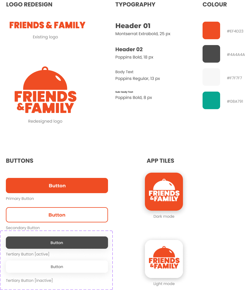
DESIGN SYSTEM The choice of bright orange as the primary colour came from a need to create familiarity and warmth. I want users to feel welcomed and to relieve some of the pressures and frustrations they may have had from their professional day-to-day.
In essence, this also meant a complete redesign of Friends & Family’s existing logo - to keep consistent with the design system used in the mobile app design.
Second Usability Study
HIGH FIDELITY PROTOTYPEI conducted a second unmoderated usability study with our high fidelity prototype. Each of our 5 participants had 15 minutes to go through a set of tasks.
I found that the majority of participants experienced issues with our cart and checkout flow.
As a way to add more items, I noticed that all participants opted to click the “Home” icon in the bottom navigation to add more items. Therefore, I removed the “Add more items” button as it was significantly under-utilised wasting screen space. Instead I added a back button and a prompt to show “what others are adding” for 50% of “Checkout” clicks.
I refined our checkout flow to decrease the initial confusion and information overload. The participants spent a majority of their time navigating through this screen as they were unsure of what to click first.
Familiarity and Accessibility
ADDING TO YOUR CARTLarge text and high quality images were prioritised while designing the home screen. This is where users can see popular menu items and weekly deals.
I opted for the user to return to the home screen as soon as they enter an item into the cart. This way, they’re able to add multiple items quickly and choose to access their cart after they’ve finished browsing.
Helpful recommendations
ADDING TO YOUR CARTInitially, I had placed the “Here’s what others are ordering” section right below the “Checkout” button as to not intrude on the ordering experience. However, I found that most users weren’t seeing the recommendations at all.
To address this, I added a non-intrusive prompt that would only show for 50% of the “Checkout” clicks. Once the app is released, it would be helpful to conduct an AB test to further calibrate this percentage.
Easy to use
CHECKOUT AND PAYMENTRather than presenting all of the information at once, I opted to use steps to guide the user where to click. The idea is to decrease drop off rates and make the flow as simple as possible for the customer to submit their order.
Customers are then able to see the progress of their orders by clicking on the notification icon at the top right.
Language translations
PROFILE SETTINGSThe usability studies found that while the language feature was recognised as useful, having the button on top navigation screen was intrusive for most users.
Instead, I moved this feature under the profile tab. It just made more sense this way.
Takeaways
This was my first time designing using the goal directed design process. Having used a lot of food delivery apps in the past (and being frustrated by them) this project was something that I was genuinely excited for. I thought there was a simple problem that needed a simple solution - and I found myself bringing in my own biases and assumptions about what the typical user may be looking for.
While not harmful in itself, our earlier user interviews were rushed and I ended up making significant iterations multiple times throughout the design process as I couldn’t quite pinpoint the user problem. If this was for a real delivery team, development would have been pushed back or the developers would have far less direction of what to build
Next Steps
I learned that persona creation and the accuracy of user goals are not to be taken lightly. Going forward, I would also like to interview more people earlier on.
What’s next for Friends & Family? The answer is a lot of post-release AB testing - specifically to determine the best placement for the language button. It will also be great to add more human like interactions similar to how a waiter would take your order.


