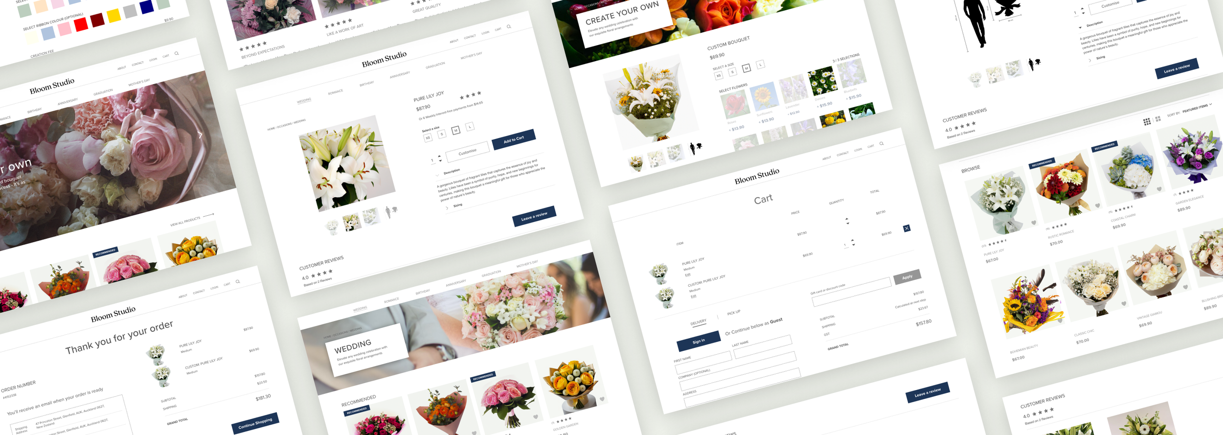
Bloom Studio

Project Vision
To create an effective and efficient experience for customers to order their floral arrangements online - one that everyone and anyone regardless of age, gender or background can enjoy. By providing an online ordering platform, Bloom Studio can expand their customer base and offer more convenient services to their clients.
For the purposes of this project, I will focus on the creation of the flower ordering flow
OVERVIEW
DURATION: March - April 2023
PROJECT: Bloom Studio - Bouquet order flow
ROLE: UX / Research / Visuals
THE GOAL
To design and implement an effective and unique online ordering platform to improve customer experience, expand their customer base, and increase sales.
CHALLENGES
Accessibility and inclusivity - must address visibility impairment and language barriers
Navigation and flow - must be easy to use and navigate
Information organisation - must be easy to find items users are looking for
Kick off
USER INTERVIEWSI started off by interviewing 10 different people who fit into our target group; I wanted to find what their unique needs or challenges might be, determine user groups and how our product might help to solve some of their problems.
HYPOTHESIS
I believed that customers would prioritise high quality images and easy-to-use searching functionality for different occasions, above all else
Understand the user's current process for ordering flowers and how they feel in their journey
Identify any pain points or issues users encounter when ordering flowers online.
Determine how users want to customise their flower orders.
Uncover any additional features or services that users want to see on an online florist website.
Determine the user's frequency of purchasing flowers and the types of occasions for which they typically purchase them.
Understand users' motivations for purchasing flowers online
Identify any common user demographics for the target audience
RESEARCH GOALS
Empathy Map
USER INTERVIEW RESULTSI collated the responses from our interviews and created an empathy map to represent our target audience
SAYS
“I always buy flowers on special occasions”
“I struggle with all the choice on online florists”
“I never know how big bouquets are going to be, I wish I could be sure before I buy it”
DOES
Sometimes buys flowers to uplift mood
Sends flowers directly to her friends from the website
Struggles to interact with buttons and understand navigation elements
THINKS
Flowers are the immediate choice of gift
There should always be an option for delivery
Websites need to have better grouping of flowers
FEELS
Overwhelmed by the amount of choice
Happy when browsing
Confused about real sizes of bouquets
Frustrated by small text and page layout
It’s clear that there are four main pain points:
Lack of product variety
Legibility
Inadequate search functionality
Limited/inaccurate product descriptions
Meet our users
USER PERSONASGEORGIA
Age: 20
Education: Fine Arts Student
Hometown: Auckland, NZ
Family: Parents and younger sister
Occupation: University student
GOALS
Highly quality pictures to get a better look at details.
Less cluttered navigation and layout for easier browsing.
Accurate and inclusive sizing for improved buying confidence.
FRUSTRATIONS
“Sometimes it’s frustrating when I receive a bouquet that is so much bigger than I thought”
“Most online florists have cluttered and small text making it difficult to read.”
“I wish bouquets were organised better so I can find them easier for different occasions.”
THOMAS
Age: 35
Education: Bachelor of Finance
Hometown: Sydney, Australia
Family: Wife, 5 year old daughter
Occupation: Finance manager
GOALS
To browse a wide variety of products available with the flowers including chocolate
Easier navigation
A well designed featured flowers section to buy popular or favourite items
To deliver a romantic experience for his wife
FRUSTRATIONS
“It’s frustrating when I’m not sure which flowers look good”
“I often need to buy chocolates separately, which takes too much time”
“I wish there were features to customise your flowers. Sometimes the available products are too big”
Competitive audit
Goal: compare the ordering experience of each competitor’s app
SUMMARY OF FINDINGS
After conducting a competitive report on various florist websites, as well as user interviews and an empathy map, i identified several key elements to prioritize for the MVP. These include the need for high quality images, clear organization by occasions, an efficient browsing experience, and a size guide for arrangements.
Additionally, we found that features such as a "most popular" section, a "recommended" section, customer testimonials, and the ability to add a customized gift message were also essential for a successful florist website.
Incorporating these findings into the design process will ensure that Bloom Studio's website meets the needs of its customers and stands out from its competitors.
Early Concepts
CRAZY EIGHTSTo begin the design process, I used the method of ‘crazy eights’ to quickly generate a large quantity of design ideas in a short amount of time.
This allowed me to rapidly explore a wide range of design possibilities for the placements of components and test layouts. The idea was to generate fresh, innovative solutions and not get caught up in the detail
Wireframes
DIGITAL USER FLOWAfter refining the my paper wireframes, I began creating a prototype to begin testing the user flow and other primary features
First Usability Study
LOW FIDELITY PROTOTYPETo determine whether the prototype was on the right track I conducted a remote unmoderated usability study It was essential I do this early as possible to better understand the needs, behaviours and expectations of our target users.
Each of the 5 participants were aged between 18 and 50 and were given 15 minutes to complete 5 tasks in a lofi prototype
RESEARCH GOALS
To determine if users navigate the site with ease according to their needs.
To determine the usefulness of the customisation options so far
To understand any specific challenges that the user may face
KEY PERFORMANCE INDICATORS
Time on task: to measure the time it takes for users to complete the order and payment journey
Drop-off rate: To understand participant engagement and motivation, as well as identifying potential issues with the study design or user interface.
User satisfaction (ratings): to measure the level of satisfaction users have with the interface after submitting an order
Usability Study Themes
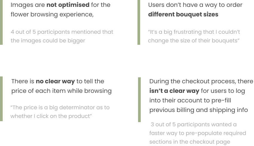
PATTERNS AND INSIGHTSThe following were the most common themes across the usability studies
Iterate… and re-iterate
DIGITAL WIREFRAMESUsing our insights we updated our low fidelity wireframes. We prioritise larger images and a new log in screen.
Visual Design
DESIGN SYSTEM I opted for neutral colours to ensure that the experience can be inclusive to all people - no matter who they are or they come from. A serif font was chosen for the logo to indicate quality and luxury
Efficient Browsing
To prioritise easy navigation, I placed the more popular occasions at the top followed by a large hero carousel to show the latest events, products and features. The images are large and the amount of text is minimal.
Additionally, it was also important to place a “latest review” section with large user generated images at the bottom so customers are able to confirm the reliability of Bloom Studio’s services.
High quality images and accurate sizing
ADDING TO YOUR CARTFrom the interviews, it was clear that customers were often unsure how big or small bouquets may be when ordering online. Even if the size details are given, it would be helpful to have a reference image. Naturally, this gave me a chance to add as many features to help the customer get as much accurate information as possible before making the purchase. The descriptions are clear and indicate what the type of flower symbolises.
Exceptional customisation options
BOUQUET CUSTOMISATIONCustomers would also be able to customise their bouquets to make it more personal to them. Given that flowers have different meanings, the research suggests that some customers would like to add their own meaning behind the gifts. However, allowing customers to customise any of the bouquets available on the platform would make little sense from a business perspective. That’s why this feature will only be available for select bouquets.
Intuitive checkout and payment
CHECKOUT AND PAYMENTExisting online florists have a lot of form filling. The usability studies suggest that customers would prefer an option to pre-fill any of the repetitive information as much as possible. As such, I added the option for the user to sign in as soon as they enter their cart.
Once the information is pre-filled, customers are then able to edit it as the delivery address may often times be different from their own. It was also important to have the gift message section as visible as possible.
Takeaways
This was my first time designing for a responsive website and it was difficult to structure the same content for both a desktop and mobile resolution. This time, I spent a long time conducting user research so that the product can accurately address the target user’s problem.
In hindsight, I could have taken more time in testing the low fidelity prototypes with users and interviewed a variety of people before going onto developing a high fidelity mockup. It took a long time to try solve foundational problems at the high fidelity mockup stage and this would have been especially difficult in a real software delivery team.
Next Steps
Going forward, I would also like to take more time in the competitive audit process and understand how our competitors have solved common issues in the past.
What’s next for Studio Bloom? This document will be handed to the development team to make an initial spike on the effort required. Product managers will also have a copy of this to flesh out user stories and populate a roadmap and release timeline.


